Shelly Engelman, PhD
  • Home
  • About
    • Services
    • CLIENTS
  • SAMPLE DASHBOARDS
  • Dashboard WKSHPS
  • Tips & Tricks
  • Contact

SAMPLE
INTERACTIVE DASHBOARDS
 cOPYRIGHT © 2022 sHELLY ENGELMAN, PHD

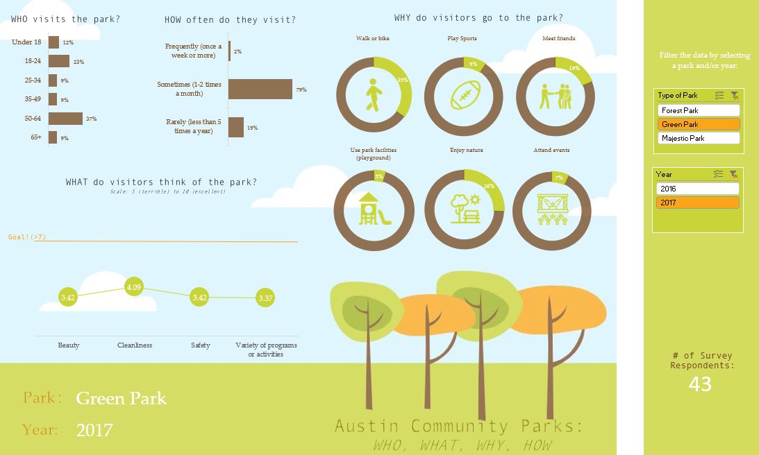
Each of the following sample dashboards are interactive​ and were created in good ol' Excel. Check them out! Download a dashboard and use it as inspiration for your own designs!
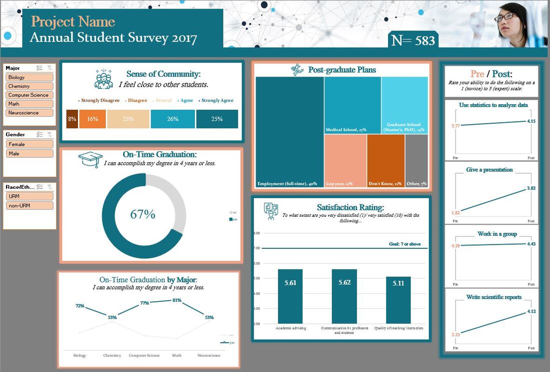
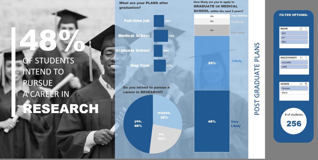
Picture
CLASSIC
​DASHBOARD
The "classic" dashboard utilizes classic design principles related to color, organization, and chart type. It also includes an interactive 'appendix' sheet and 'introduction' tab to help orient the user and provide a more granular look at the data.  
​
Download

Picture
PARK
​DASHBOARD
The "park" dashboard is intended to be eye-catching and playful by design. The figures and charts are pasted directly onto a background image (clouds and trees) that serves to emphasize the subject matter (parks!). Form follows function.
Download

Picture
PRE/POST
​​DASHBOARD
The "pre/post" dashboard captures change/growth from pre to post. This is a great way to showcase statistically significant (p<.05) differences in pre/post data. When the p value is less than .05, the figure label turns orange. It's magical...check it out!
Download

Picture
GRADUATION
​​​DASHBOARD
The "graduation" dashboard is all about drama. Select a dark background color to make your charts pop! Also, check out how I integrated key statistics (e.g., year graduated) directly into the silhouette of the graduate. Make your images work for you!
Download

Picture
MULTI-CONSTRUCT
​​DASHBOARD
The "multi-construct" dashboard almost functions like an interactive report. This option is ideal for complex surveys that span multiple constructs. The multi-construct dashboard contains multiple dashboards in one workbook. This design is user friendly and can summarize A LOT of data!
Download

Picture
HOLIDAY -COVID-
​ DASHBOARD
The "holiday" dashboard (Covid-19 edition) uses icons, icons, and more icons to help guide the user. There are also sample discussion questions towards the bottom of the dashboard. Discussion questions are a great way to help users focus on the most important data findings; otherwise, it's easy to get lost in the weeds! 
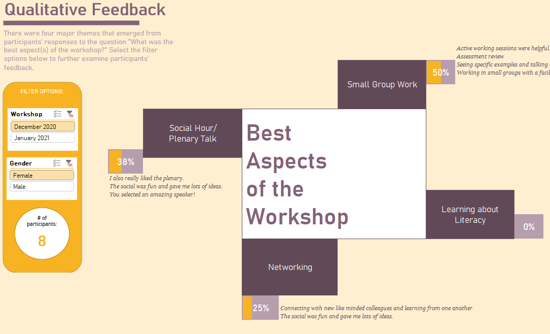
Download

Picture
SPLIT IMAGE
​ DASHBOARD
The "split image" dashboard allows you to emphasize certain numbers or statistics from your dashboard that are most interesting to your stakeholders. Use this design to call attention to an essential statistic that directly answers a critical research question.
Download

Picture
QUALITATIVE
​ DASHBOARD
Interactive dashboards are not just for quantitative data! Here, I've displayed qualitative data gleaned from a feedback form. There were four major themes that emerged from the qualitative analysis. Select the filter options to see how participants' responses differed by gender and workshop type.  
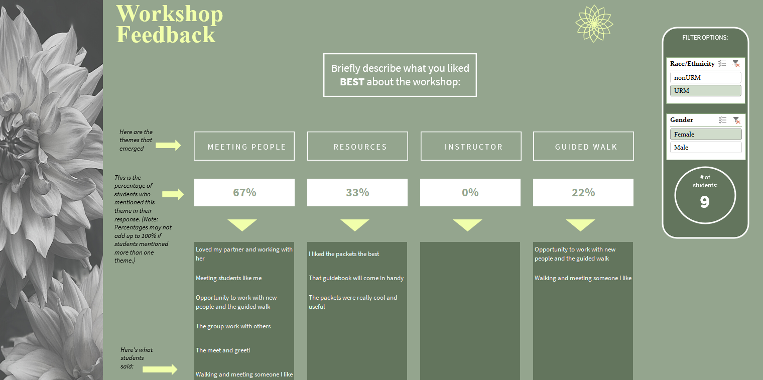
Download

Picture
QUALITATIVE
​ DASHBOARD II
My clients loved this dashboard layout that clearly captures the major thematic categories and the quotes associated with each category. Checkout how the responses change when you toggle between females and males, and underrepresented minority (URM) and nonunderrepresented (nonURM) students!
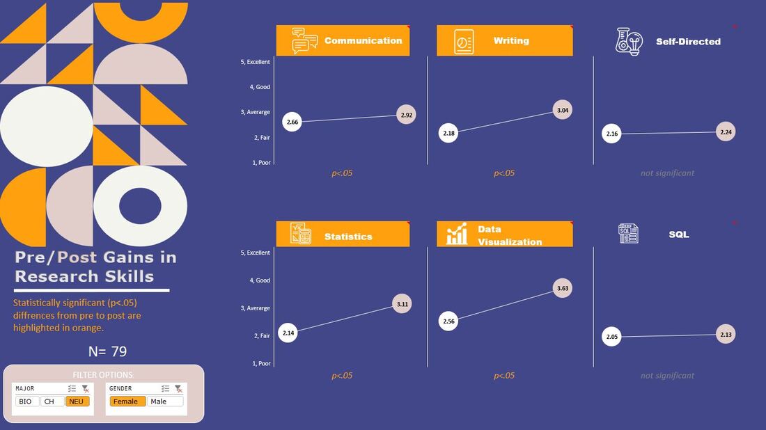
Download

Picture
QUALITATIVE
​ DASHBOARD III
Have you ever wanted to connect participants' quantitative ratings with their qualitative feedback? This interactive dashboard does just that! See how participants' descriptions of the workshop varied by their ratings on a Likert scale: Poor (1) to Excellent (5). What do the "Poor" ratings have in common? What about the "Excellent" ratings?
Download
Shelly Engelman, PhD           Copyright © 2022
  • Home
  • About
    • Services
    • CLIENTS
  • SAMPLE DASHBOARDS
  • Dashboard WKSHPS
  • Tips & Tricks
  • Contact