Here are the steps that I used to create my interactive dashboard. To help me remember all of the steps, I affectionately refer to this method as the PARCS method. (Shoutout to my favorite TV show, Parks & Rec, for inspiring the acronym!) PARCS stands for: P- Pivot A- Analyze R- Rename C- Chart S- Slice Let's do an example, together... Step 1: Insert a Pivot table To insert a pivot table, first select your data. Then, go to the INSERT ribbon and select Pivot Table in the upper left-hand corner. A dialogue box will open. Make sure that you place your new pivot table on a "new worksheet." Select "OK." Step 1: Done! 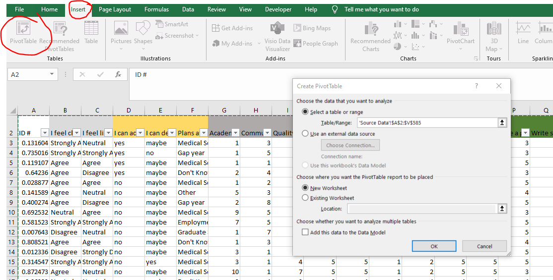 Step 2: Analyze your data within the Pivot Tables fields On a separate sheet, you should see an empty pivot table. Start dragging and dropping your variables from the fields window into the Rows, Columns and Value areas. Here, I dragged "Plans after Graduation" into both the Rows area and the Value area to give me a count of the number of students who plan to go to graduate school, medical school, etc. To make things easier on my user, I decided to convert the counts to percentages. To do this conversion, I simply right clicked on "Count of Plans after Graduation" and then selected "Show counts as" in the dialogue box. It's so easy to quickly go from counts to percentages ("% of Grand Total") in a Pivot Table. Only two clicks needed! Ready for Step 3? It's a weird one... 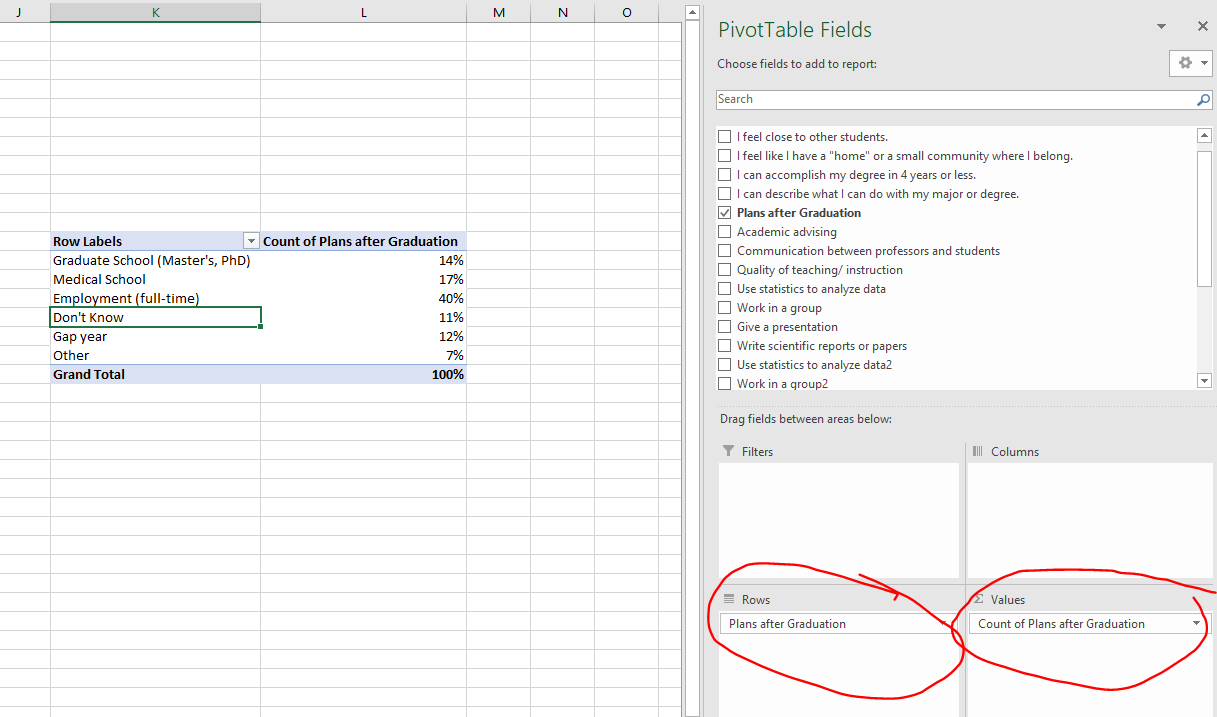 Step 3: Rename your Pivot Table Did you know that Excel assigns names to each of your Pivot Tables? I know! Excel creatively (sarcasm!) assigns the names Pivot Table 1, Pivot Table 2, Pivot Table 3, etc. to all of the pivot tables in your workbook. When deciding how to slice and dice your data in an interactive dashboard, this naming structure can be a nightmare...trust me! To help you recognize each pivot table, let's rename the tables to something more user friendly. For example, for this pivot table (below), I renamed it from "PivotTable1" to "Plans after Grad." Ah...much better. To rename your pivot table, right click on it. Then, select "Pivot Table Options" in the dialogue box. Within the Pivot Table Options, go to "PivotTable Name" and type in a new name.  Step 4: Chart your data Let's start visualizing our data! To chart your data, place your cursor within your Pivot Table, Then, go up to the INSERT ribbon. (Everything lives in the Insert ribbon, am I right?) Within the insert ribbon, select "Pivot Chart" and select your favorite graph! Your graph is going to initially look wierd, so you need to clean it up by getting rid of those pesky grey labels. To remove the grey labels, right click on one of them and select "Hide all field buttons on chart." Poof...gone! BTW: There are "good" charts to use in an interactive dashboard and "not so good" charts. But, maybe that's a topic for another time. Let's first get the basics down before we start getting fancy! 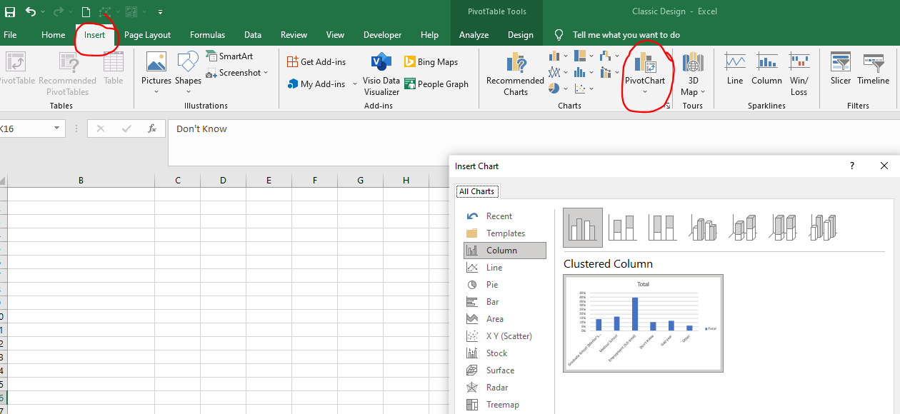 Ready for the magic? Step 5: Slice your data The secret ingredient when it comes to designing an interactive dashboard in Excel is something called "Slicers." Ever heard of it? Yeah...I didn't discover it until 2-3 years ago, so don't feel bad. Slicers make the dream work. Here's how to insert a slicer: First, place your cursor anywhere in your Pivot Table. Then, go to the INSERT ribbon and select "slicer." (Yep...what did I tell you! You're basically going to live in the insert ribbon.). Once you select slicer, Excel will ask you to check off the variables that you want to slice and dice the data on. In my case, I selected Major, Gender, and Race/Ethnicity. Once selected, I hit "OK." Bam! I have 3 slicer menus! So cool, right? Play around with your slicers and watch your chart and pivot tables change before your very eyes. 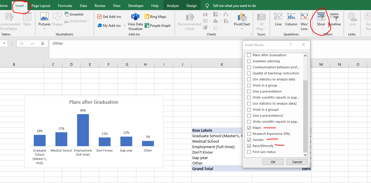 Final step: Cut and Paste your charts and slicers on another sheet and call that sheet "Dashboard"
That's all there is to it! Just remember to "cut" not "copy" your charts and slicers. If you have two copies of things in your workbook, Excel tends to freak out a bit. Excel doesn't like twinsies! If you are curious to know how your slicers are connected to your dashboard, you can right click on one of your slicers and go to "Report Connections." Within Report Connections, you should see a list of all of the Pivot Tables in your entire workbook. (This is why we did Step 3, btw! Without renaming your Pivot Tables, you will get a long list of numbers. Not good.) To further customize your dashboard, you can select which pivot table goes with which slicer by checking and unchecking the boxes within the report connections dialogue box. Happy dashboarding! Check out some of my other interactive dashboards here!
0 Comments
Leave a Reply. |

AuthorHi y'all! I'm Shelly Engelman, Ph.D. |

 RSS Feed